
How to Use On-Brand Imagery in Your Content
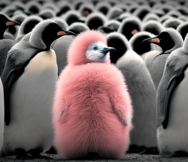
On-brand imagery for small business helps people recognize your work before they read your name. But recognition takes more than putting a logo in the corner. The subjects you show, the light you choose, and the way you frame a scene all shape what someone expects from your business.
Imagine a warm, hands-on service whose website is filled with cold office towers and anonymous boardrooms. The photographs may be polished, yet they tell the wrong story. Your imagery should make the experience you offer easier to understand. Start there, and visual consistency becomes a useful decision rather than a decorating exercise.
Decide what your images should help people feel and understand
Choose a few qualities that describe the experience of working with you. Then translate each one into something a photographer or designer could actually show. “Approachable” might mean relaxed expressions, familiar settings, and a view of people working together. “Precise” might appear through clean compositions and close-ups of careful work.
Consider a hypothetical custom furniture maker. If the promise is thoughtful craftsmanship, images of joints, wood grain, and fitting a piece into a customer’s space can support that promise. A glossy photograph of a generic luxury living room may say less about the maker, even if its colors match the brand perfectly.
This distinction matters when reviewing images. Ask what a person could reasonably learn from the picture. If the answer is only “we like this color,” you may need a stronger connection to the content.
Give on-brand imagery for small business a visual direction
A useful image guide describes choices you can repeat. Explain whether photographs should feel bright and open or rich and intimate. Decide whether backgrounds are simple or full of context. Consider whether people look toward the camera, interact naturally, or appear mainly through their hands at work.
Build a small reference collection and write a sentence beneath each example explaining why it fits. Include a few images that do not fit, with the reason. “Too staged for our conversational style” helps someone make a decision. “Not quite us” leaves them guessing.
Keep the guide flexible enough for different subjects. A team portrait and a close-up of a product do not need identical compositions. They should share enough qualities that they feel comfortable beside each other. Consistency comes from a shared direction, not from forcing every photograph through the same filter.
Plan photographs around the places they need to work
Before a photo session, look at the spaces you need to fill. A website banner may need a wide composition with room beside the subject for a heading. A portrait crop needs the important detail closer to the center. A behind-the-scenes article may need several images that explain the work in sequence.
Tell the photographer what each image must communicate as well as where it will appear. “Show the care that goes into packaging an order” is a more useful brief than “get some content shots.” Capture an overall view, a closer detail, and a variation with extra space around the subject. Those options give you room to design without cropping away the point of the photograph.
Prepare the setting, too. Remove distracting objects, check what is visible on screens, and make sure the space reflects how you want the work presented. The goal is a clear, honest view of your business. A setup that suggests facilities, staff, or services you do not have creates expectations you cannot meet.
Choose stock images for relevance before polish
Stock can be useful when you need a supporting scene or cannot photograph a subject yourself. The challenge is finding images that belong with your own material. Compare the lighting, setting, perspective, and emotional tone. A dramatic corporate handshake may look out of place beside candid photographs of a small creative studio.
Look closely at the details rather than stopping at the search term. Does the activity resemble the work you are describing? Are the tools and surroundings plausible? Does the image help the reader understand the subject, or is it simply filling space? A quieter, more relevant photograph often serves the page better than a striking but unrelated one.
Keep a record of where each asset came from and the usage terms supplied with it. Do not present stock models as your staff or an illustrative scene as a completed client project. The image’s role should remain clear.
Build variety around a few recognizable choices
A recognizable brand can include photographs, illustrations, and simple graphics. Give those formats something in common: a restrained palette, a consistent approach to spacing, or a similar level of detail. Then allow each format to do its own job.
Photography can show actual work and people. An illustration can explain an abstract idea. A simple graphic can make a process easier to follow. If everything becomes a text-heavy square, you lose those differences and ask the reader to work harder than necessary.
Use templates as a starting point. Adjust them to suit the content instead of shrinking a long message until it fits. A strong idea may need a short headline and an accompanying paragraph, while a visual demonstration may need almost no text over the image at all.
Check the image where your reader will see it
A design that looks clear on a large monitor can become crowded in a small preview. View the finished piece at the size people will encounter. Check whether the subject remains recognizable, the crop feels intentional, and any essential text is easy to read.
Make sure the surrounding copy explains the point as well. If an image carries information, its alt text should convey the meaningful visual content in context. Avoid using that field as a place to repeat a string of keywords. If a diagram needs a fuller explanation, put that explanation in the article where everyone can use it.
Review the relationship between the picture and the heading. A reader should not have to work out why they belong together. Sometimes the best improvement is choosing a more specific image; sometimes it is writing a clearer caption.
Keep the images you use easy to find
Create a small approved library instead of searching from scratch each time. Give files descriptive names and group them by subject or use. Keep original files separate from cropped versions so you can adapt an image later without repeatedly working from a reduced copy.
Add a short note when an image has a limited purpose, an outdated detail, or a restriction on use. Review the collection when your services, team, or visual direction changes. An attractive photograph can still be the wrong choice if it describes a version of the business that no longer exists.
Make the visual promise match the real experience
The strongest on-brand imagery for small business creates a familiar feeling across a website, an email, and a proposal. More importantly, that feeling holds up when someone becomes a customer. The visual promise and the actual service should support each other.
Start with a page you use often. Replace the image that says the least, improve the crop that hides the subject, or write the direction that makes the next photo session more useful. Small, deliberate choices build a clearer visual identity over time.
At DeBella DeBall Designs, the visual story belongs with the business strategy. If your content looks good but the path from interest to inquiry feels unclear, explore Operation Sign Your Next Client™ and connect that first impression to a purposeful next step.